
[Update: The Singapore Icons series of ceramic ware was awarded the 2013 President's Design of the Year, organised by the Design Singapore Council.]
ampulets was invited by Supermama to create a design for a series of ceramic ware for the "Singapore Icons" project. The project is produced by Japanese ceramic brand Kihara Inc , under Supermama's new label Democratic Society. Why the title "Days of Lightning"?
In many ways, the speed, illumination and force of lightning make it an apt expression for Singapore's much admired progress in the last 50 years. It has been a a progress marked by an assertive and rapid pace of change, illuminated by the inspired efforts of its people, and led by a charged focus.
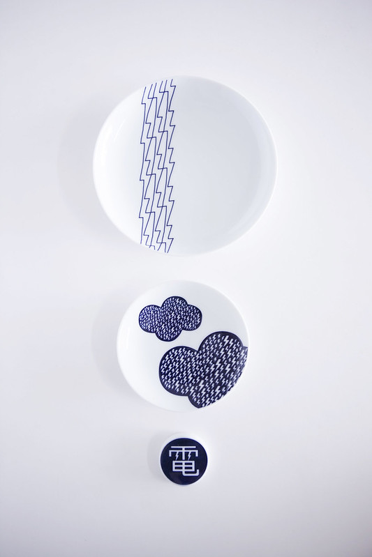
With all this in mind, we created a chopstick rest with the Chinese character for lightning (電 a combination of the words for rain and electricity), incorporating the symbol to express its immediacy and energy, and making its meaning intuitive and universally understood.
For the 10cm plate, we created a circular field of lightning, where the individual energies are concentrated and coherent within a unified form. For the 15cm plate, we created a pattern of crisscrossing lines. It is an abstraction of merged lightning symbols that gives the suggestion of cracks across the plate.
ampulets also designed the identity for Democratic Society, which you can read more about here.
Limited stock of the Singapore Icons plates and chopstick rest are available for sale online (inventory.sg) and at Supermama (8 Queen Street, Level 1 of the Singapore Art Museum).
Project Year: 2012