
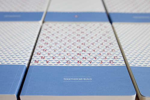
As a continuation of our work to revisit the school's visual identity, we used again the updated hues of the school colours from our last project. We also lifted and extended the wave motif from the school's crest and introduced the school's motto into the notebook design. The aim is to re-introduce these familiar elements of the school's visual identity, giving them a fresh and youthful interpretation.
Project Year: 2012