
With the reintegration of Raffles Institution and Raffles Junior College as one, Eagle Eye is
the institution's first publication distributed to all its students, its alumni, friends and benefactors. The inaugural issue focused on a Rafflesian's journey from Year One Orientation to the GCE 'A' Levels.
Our aim was to challenge and transform the expectations of the publication's very diverse audience of what a school publication should look like. In doing this, we wanted to bring across the institution's boldness and forward-thinking - qualities its students would aspire to and be proud of, and its alumni and supporters would celebrate.
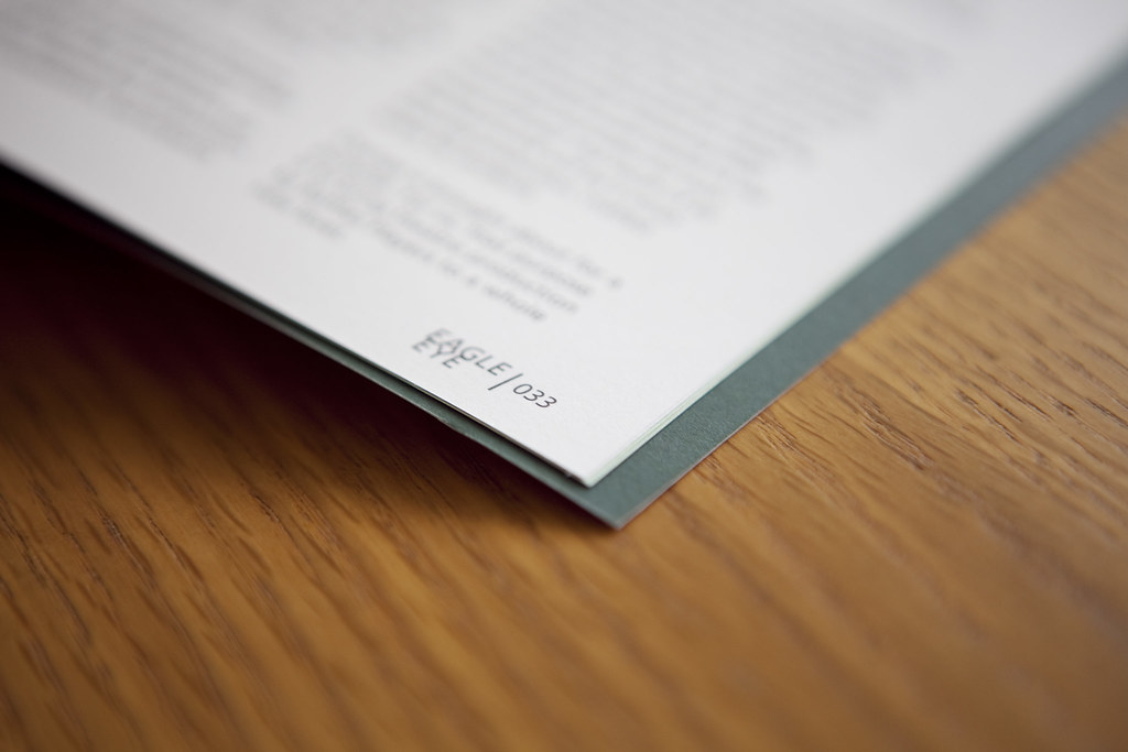
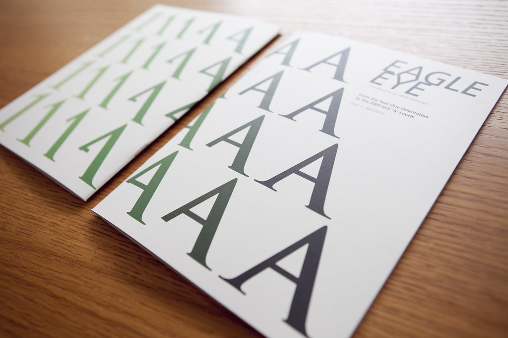
Starting with the cover, we wanted a design that would not entirely give away the publication's content, but would reward the reader's curiosity with the experience of discovering and interacting with each issue's theme. For this inaugural issue, the school's corporate communications department gamely agreed with us to depart from the usual photography, relying entirely on the subtle transformation of colour and typography from the numeric "1" to alphabet "A" to express its theme.
We then stripped the inside pages of the busy graphics and backgrounds typical of many school or community publications, to let the students' writing and photographs themselves speak for the richness of the students' school experiences. Our priority was an intuitive layout that would balance variety with consistency in showing off the students' work. For the content, we also collaborated with our favourite editorial partner Yu-Mei Balasingamchow who copyedited.
All 12,500 copies are printed on recycled paper stock.


Project Year: 2010