
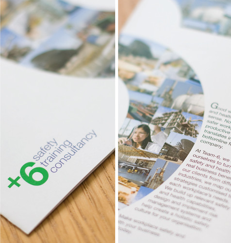
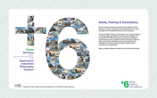
We created a new visual identity for the company Team-6 Safety Training and Consultancy as part of its re-branding exercise. Given the company's strong track-record and experience in the industry, we created a visual identity that better projected the company's professionalism and authority in the subject, while reflecting the company's combination of experience and energy.
The design abbreviated “Team-6”, using a plus symbol to reflect the value that the company brings to its clients, but also resembling the commonly-used green safety symbol at worksites. The green and violet are colours that suggested life, authority and vitality.
We further extended its new visual identity in a brochure introducing the company's services, and re-developed the company's name cards and corporate website.
Project Year: 2008